Pantone: The “Color Bible” of the Packaging and Printing Industry
Pantone gives packaging teams a shared color language. Learn how Pantone standards, paper, printing, and samples work together to achieve consistent brand colors.
Pantone: The “Color Bible” of the Packaging and Printing Industry
After working in packaging and printing for many years, I would like to talk about the “color bible” of our industry—Pantone.
I first came across Pantone in 2008.
At that time, a customer asked us to use PANTONE 19-4052 Classic Blue for a jewelry box. I was confused. There are hundreds of shades of blue, so which blue did the customer actually mean?
An experienced printer simply took out a Pantone color guide and said:
“Follow this standard, and you will not go wrong.”
That was when I truly understood that color also needs a common language.
Why Was Pantone Created?
Pantone founder Lawrence Herbert had a background in chemistry. While working in the printing industry, he noticed that people often described colors in very subjective ways.
One person might say “sky blue.” Another might ask for “deep ocean blue.” Someone else might want “a slightly cooler blue.”
These descriptions were difficult to apply accurately in production.
To reduce confusion in color communication, Pantone introduced its first color-matching system in 1963. It assigned specific numbers to colors and created a more consistent reference for designers, customers, and printers.
Since then, Pantone has helped different teams communicate color more clearly.
Why Is Pantone Important in Printing?
Suppose a customer wants a specific brand blue.
If they simply say “Tiffany blue” or “dark blue,” different people may understand the request differently. But when the customer provides a Pantone number, the design and production teams have a clear reference.
For example:
PANTONE 1837 C
Based on the color standard, the printing operator can prepare a suitable spot-color ink instead of relying only on CMYK four-color printing.
In some applications, spot colors can provide stronger saturation and help reduce color differences between production batches.
However, a Pantone number alone cannot guarantee that the final color will be exactly the same in every situation. Paper, coating, printing equipment, ink, and lighting conditions can all affect the result.
For this reason, a Pantone color is an important reference, but it should still be checked together with the actual material and print sample.
A Real Packaging Example
Last year, we produced packaging for a premium scented-candle product.
The customer specified PANTONE 15-0950 TCX, a lemon-yellow shade, and wanted the color to remain consistent from the design artwork to the final production.
Before printing, we confirmed the Pantone system requested by the customer and checked how the color appeared on the selected paper.
Different Pantone systems, such as Pantone FHI, TCX, TPG, and Graphics, are designed for different materials and applications. They should not be used interchangeably without confirmation.
After reviewing the sample and making the necessary adjustments, the final packaging matched the customer’s expectations and passed inspection smoothly.
This project showed us that choosing a Pantone number is only the first step. Identifying the correct color system, matching the paper, and checking a physical sample are equally important.
Pantone’s Color of the Year
In addition to its color guides, Pantone’s annual Color of the Year attracts attention from the design, fashion, home, electronics, and packaging industries.
The 2024 Color of the Year was:
PANTONE 13-1023 Peach Fuzz
Peach Fuzz is a soft and gentle peach tone. It creates a warm, friendly, and comfortable feeling.
The 2025 Color of the Year was:
PANTONE 17-1230 Mocha Mousse
Mocha Mousse is a warm and soft brown with coffee, cocoa, and earthy undertones. It can work well in home products, food packaging, beauty products, and premium gift boxes.
For 2026, Pantone selected:
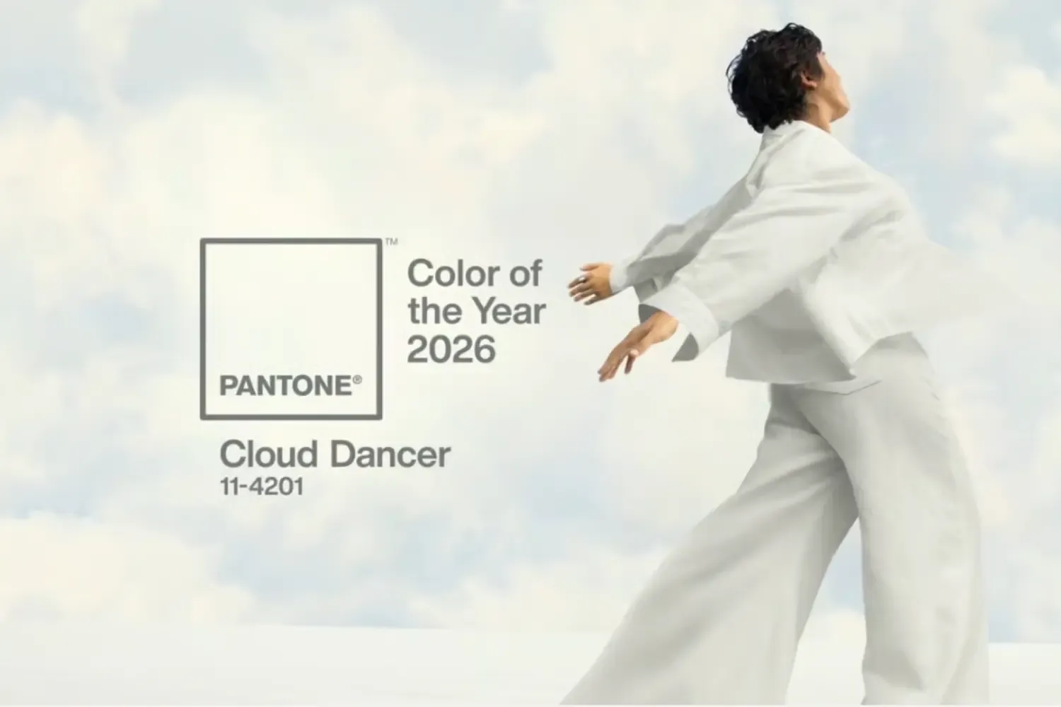
PANTONE 11-4201 Cloud Dancer
Cloud Dancer is a light and delicate white. It is a particularly notable choice because it is not a strong or highly saturated color. Pantone describes it as a calming and open shade that represents clarity, reflection, and new creative possibilities.
Unlike bright colors, Cloud Dancer works more like a foundation color. It can be used on its own or combined with other shades to create a clean, calm, and spacious visual effect.
For example, it can be paired with:
- Gray for a modern and simple appearance;
- Beige for a natural and warm feeling;
- Gold for a refined and premium look;
- Light blue for a fresh and peaceful impression;
- Dark brown for a stable and textured contrast.
The value of Pantone’s 2026 Color of the Year is not simply to tell designers what color is popular. It also provides a reference for understanding consumer emotions and broader design trends.
What Should You Consider When Using Pantone Colors?
1. Confirm the Pantone System
Pantone Graphics, TCX, TPG, and other systems are designed for different applications and materials.
A Pantone guide for paper printing should not automatically be treated as the same standard used for textiles or industrial materials.
2. Consider the Paper
The same Pantone color may look different on coated paper, kraft paper, specialty paper, or laminated paper.
The paper’s base color, ink absorption, and surface finish can all affect the final result.
3. Do Not Rely Only on the Screen
Computer and phone screens use RGB light to display color, while printed packaging depends on ink and paper.
Therefore, screen color should only be used as a design reference. It cannot fully replace a physical color guide or printed sample.
4. Check a Physical Sample
When color accuracy is important—especially for brand colors, jewelry boxes, cosmetic packaging, and premium gift boxes—it is better to approve a physical sample before mass production.
5. Record the Production Conditions
Paper, ink, printing equipment, coating, and finishing processes can all influence the final color.
Keeping a record of these details can help maintain color consistency for future orders.
Pantone Is More Than a Color Guide
Over the years, Pantone has developed from a printing reference into an important color language for the design industry.
It helps customers describe colors more accurately, helps designers create consistent visual systems, and helps printing companies reduce communication and production errors.
In packaging, color affects more than appearance. It also influences a customer’s first impression of the brand.
However, a color does not become better simply because it is bright, and packaging does not automatically become more premium just because it uses a Pantone color.
What matters is whether the color suits the brand, matches the product, and can be reproduced consistently under real production conditions.
The value of Pantone is that it changes color from “something that looks close” into a standard that can be checked, applied, and reproduced.
For the packaging and printing industry, accurate color management is not an extra decoration. It is an important part of quality control and brand consistency.
The 2026 color Cloud Dancer also reminds us that color does not always need to be complex or intense. Sometimes, cleanliness, calmness, and open space can communicate a brand’s values just as effectively.
Source: Pantone Color of the Year 2026