Aug 26, 2026 Design Insights
Three Prepress Details That Can Make or Break Your Packaging
A few minutes of prepress checking can protect the quality, cost, and delivery of an entire packaging project.
It was 11 p.m. when a designer named Alan sent a message to the team group:
“The artwork has already been sent to the printing factory. I suddenly realized that I forgot to convert the text to outlines. I am really worried.”
Two hours later, he sent another message:
“It happened. All the fonts have changed to the default typeface. How am I going to explain this tomorrow?”
Scenes like this happen frequently in the packaging and printing industry.
A small prepress mistake can lead to rework, delayed delivery, or even the rejection of an entire production batch. Designers lose sleep, while business owners watch their money disappear into printing costs.
After years in the printing industry, experienced production teams often say most packaging problems start during prepress.
Today, let us look at three details that are easy to overlook but can create serious problems if they are not checked carefully.
1. Bleed
What Gets Cut Is Not Only Paper—It Can Also Be Your Budget
A common problem:
A brand ordered 5,000 seasonal gift boxes. When the boxes arrived, part of the logo had been cut off. Some images were missing, and important information was incomplete.
The entire batch had to be reviewed and reworked.
What caused the problem?
The artwork had been placed too close to the final cutting edge. Even a small cutting deviation could remove important content or leave an unwanted white edge.
The solution:
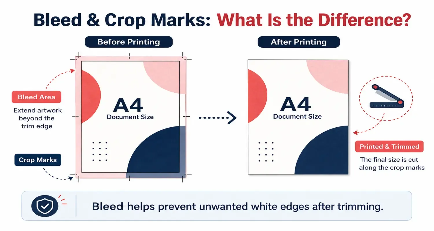
Bleed is the extra area added outside the final product size. For most packaging projects, a 3 mm bleed is a common starting point.
Any background color, image, or pattern that needs to reach the edge should extend beyond the final cutting line.
- Keep logos, product information, and important text at least 5 mm inside the safe area.
- Extend full-bleed backgrounds and images beyond the cutting line.
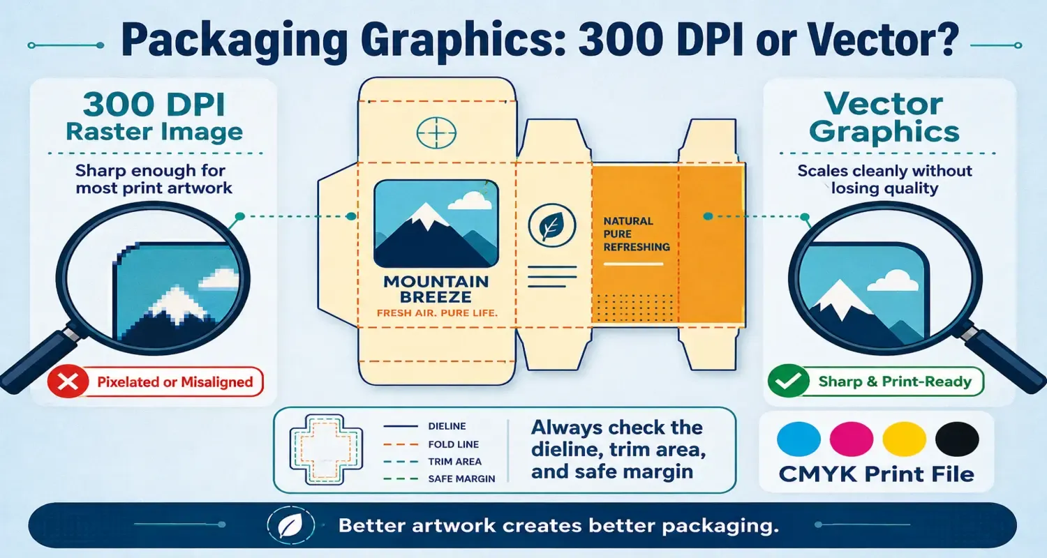
- Check the dieline carefully. Solid lines usually indicate cutting lines, while dashed lines usually indicate folding or creasing lines.
In simple terms: Keep important content inside, extend background elements outside, and treat 3 mm bleed as a basic requirement—not an optional detail.
2. Color
The “Premium Color” on Your Screen May Look Completely Different in Print
A common problem:
A skincare brand designed new packaging in an elegant muted gray-purple tone. On the screen, the color looked refined and premium.
When the mass-produced packaging arrived, the entire team was surprised. The elegant purple had turned into a dull, unclear color that looked neither gray nor purple.
What caused the problem?
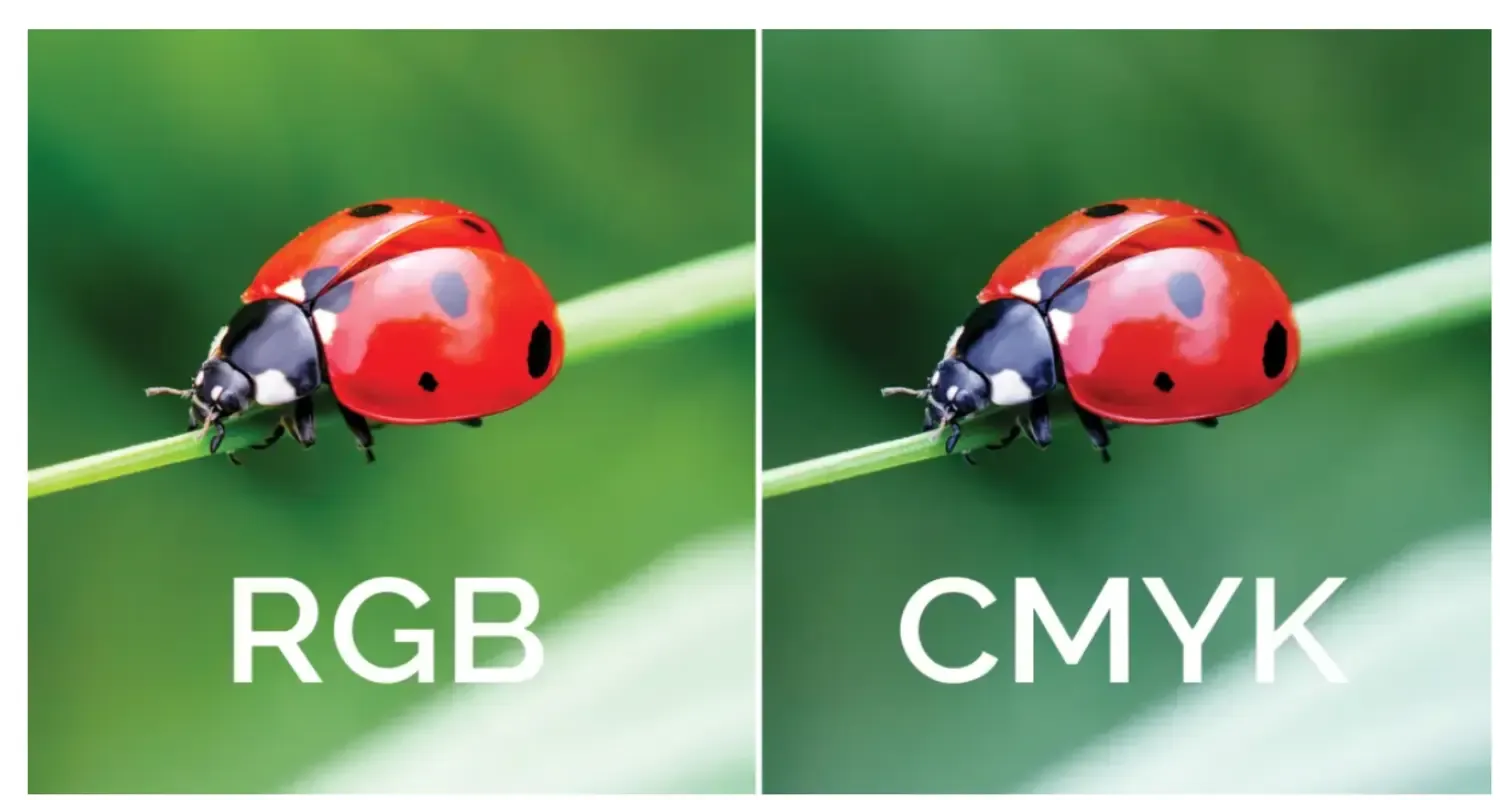
The artwork had been created in RGB mode. A screen can display many bright colors that CMYK printing can't reproduce accurately.
Purple, dark blue, brown, and four-color gray are often difficult colors to control during printing.
Common high-risk colors include:
- Dark blue: Small changes in cyan or magenta can make the color look noticeably warmer or cooler.
- Purple: Both dark and light purple can be difficult to reproduce consistently.
- Four-color gray: Gray created with CMYK can shift toward red, blue, or green depending on ink balance.
- Large black areas: Using only 100% black ink may create a flat or gray-looking background.
The solution:
- Set the artwork to CMYK before preparing the final file. RGB is designed for screens, not standard offset printing.
- Use spot colors such as Pantone when a specific color must remain stable across the packaging.
- For small text and thin lines, use single-color black: C0 M0 Y0 K100.
- For large black areas, a rich black formula such as C30 M0 Y0 K100 may create a deeper appearance, depending on the paper and printing process.
- Gold, silver, and fluorescent effects usually require foil stamping, metallic ink, or special spot colors rather than ordinary CMYK printing.
In simple terms: The screen is only a visual reference. For accurate packaging color, use CMYK, Pantone, physical samples, and a confirmed print standard.
3. Fonts
Missing Text and the Designer Who Gets the Blame
A common problem:
A tea gift box included an elegant sentence in the artwork. However, when the finished packaging arrived, the selected decorative typeface had been replaced by a standard system font.
The original design had a calm and artistic feeling. The final version looked more like an ordinary office notice.
What caused the problem?
The designer used a special font installed only on their own computer. The printing factory did not have the same font, so the system automatically replaced it with a default typeface.
The designer had forgotten to convert the text to outlines.
What does “convert to outlines” mean?
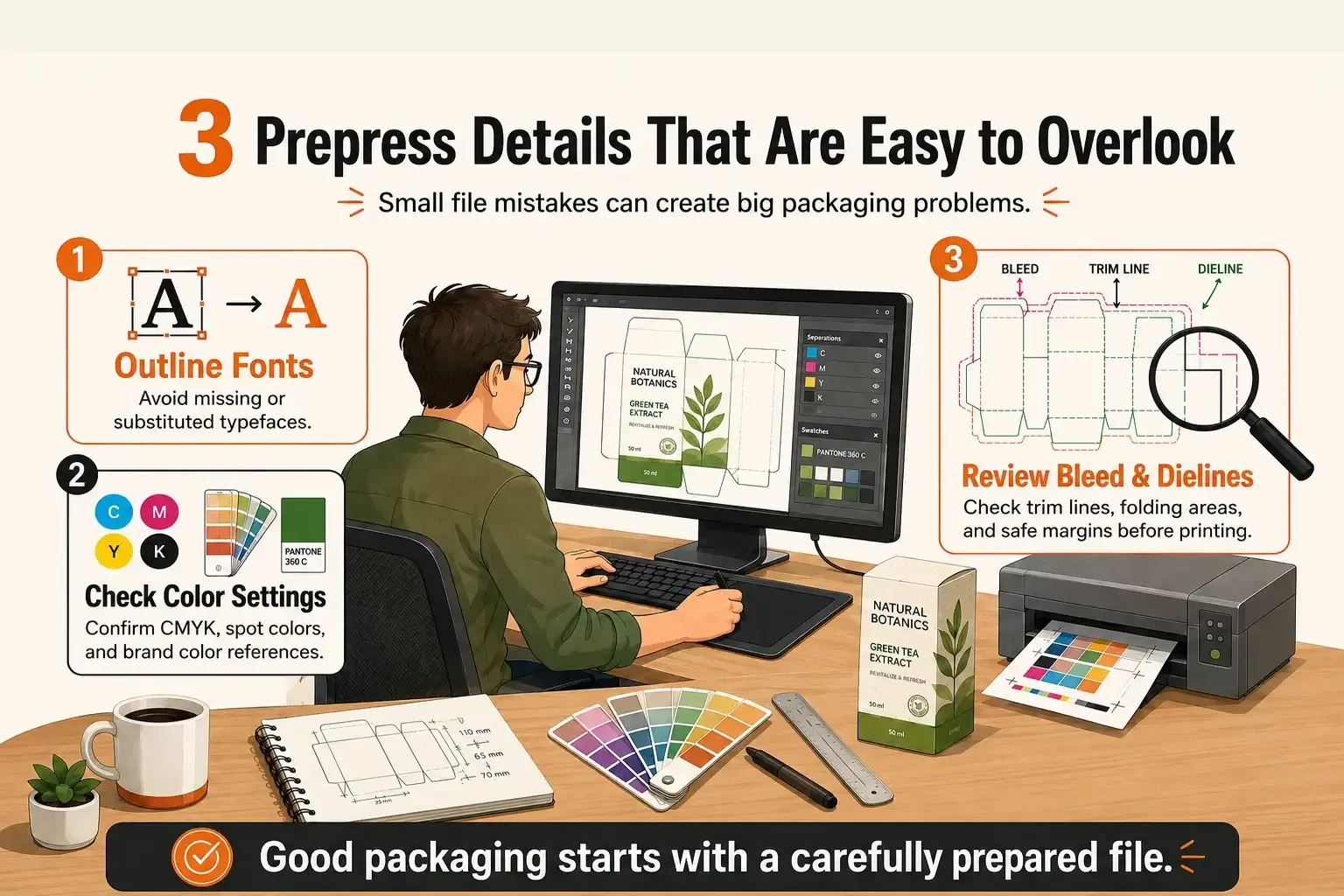
Converting text to outlines changes the letters into vector shapes. The text is no longer dependent on the font installed on another computer.
This allows the printing factory to open the artwork without missing fonts or automatic substitutions.
The solution:
- After the artwork is approved, select all text and use “Create Outlines” or “Convert to Curves,” depending on the design software.
- Check the outlined artwork carefully. Look for overlapping letters, unexpected line breaks, missing details, or strange white gaps.
- Use single-color black for small black text. Four-color black can create registration problems and blurred edges.
- Avoid extremely thin lines. In many packaging projects, lines thinner than 0.1 mm may become difficult to reproduce clearly.
In simple terms: Converting text to outlines is a basic prepress requirement. Very thin lines may disappear, and four-color black text may become blurred.
Five Minutes That Can Save Thousands
Every printing mistake carries a real cost. Before sending the final artwork to the factory, take five minutes to complete the following checklist.
- Is the bleed at least 3 mm?
- Are important logos and text at least 5 mm away from the cutting edge?
- Is the artwork in CMYK mode?
- Is a Pantone or other spot color required for important brand colors?
- Is rich black used only where appropriate?
- Has all text been converted to outlines?
- Has the outlined artwork been checked for errors?
- Are images at least 300 dpi at their final size?
- Are lines thick enough to print clearly?
- Is the file format suitable for the printing factory?
- Has the PDF, TIFF, CDR, or other required file format been confirmed?
- Has the final artwork been compared with the approved dieline and sample?
Final Thoughts
Prepress is not the most visible part of packaging production, but it has a direct effect on the final result.
Bleed protects the cutting area. Color management protects the visual quality. Converting fonts to outlines protects the artwork from unexpected changes.
These details may look small, but they can prevent reprinting, delays, and unnecessary production losses.
At HKY PACKAGE, we review packaging artwork, structures, materials, colors, and finishing requirements before production to help connect design files with real manufacturing conditions.
A few minutes of prepress checking can protect the quality, cost, and delivery of an entire packaging project.